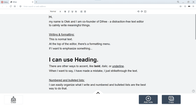
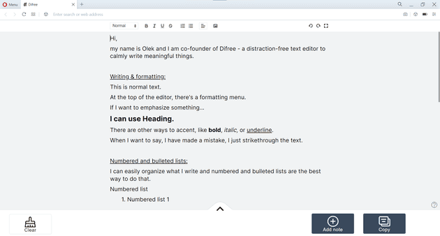
Hey, We just released a new version of Difree (0.3.5) – our distraction-free text editor to calmly write meaningful things. The big deal is a new font. Here’s why.
What’s changed?
For some, changing the font is not such a big deal. Overall, it’s just a font, am I right? For us, it is a big deal. Here’s why. In Difree, the major component is distraction-free design and font. The rest is simply bells and whistles. So far, we used Arial. Arial looked acceptable. I mean, Arial is a good font. It has a proven record of being fine. Many apps and websites use it. It cannot be bad.
But we wanted something different. We felt, Difree missed something. I mean, we tried to shape out the outlook, the buttons, the color palette. All those changes mattered to us. Yet still, the final effect was, we were missing something important, and we weren’t satisfied with the outcome.
Our goal was to choose a font, we would feel good when using it. It’s hard to describe the feeling, but let me try.

